Zorgmap
Product design
/
2021
UI and UX design, user flows, feature design, data visualization
A care worker works in somebody else’s flat, on a schedule, with one hand free. Whatever she writes down is the only thing the next shift will know – and the next shift is a different person, that same evening.
Zorgmap is a reporting tool for nurses and care workers visiting patients at home. My job was to design if from the scratch: the visit flow, the forms, the patient charts, the scheduling and reminders, the emailed report at the end of it, and the states around them. Built for a tablet, because the screen has to be big enough to type a note and read a chart, and small enough to carry all day.
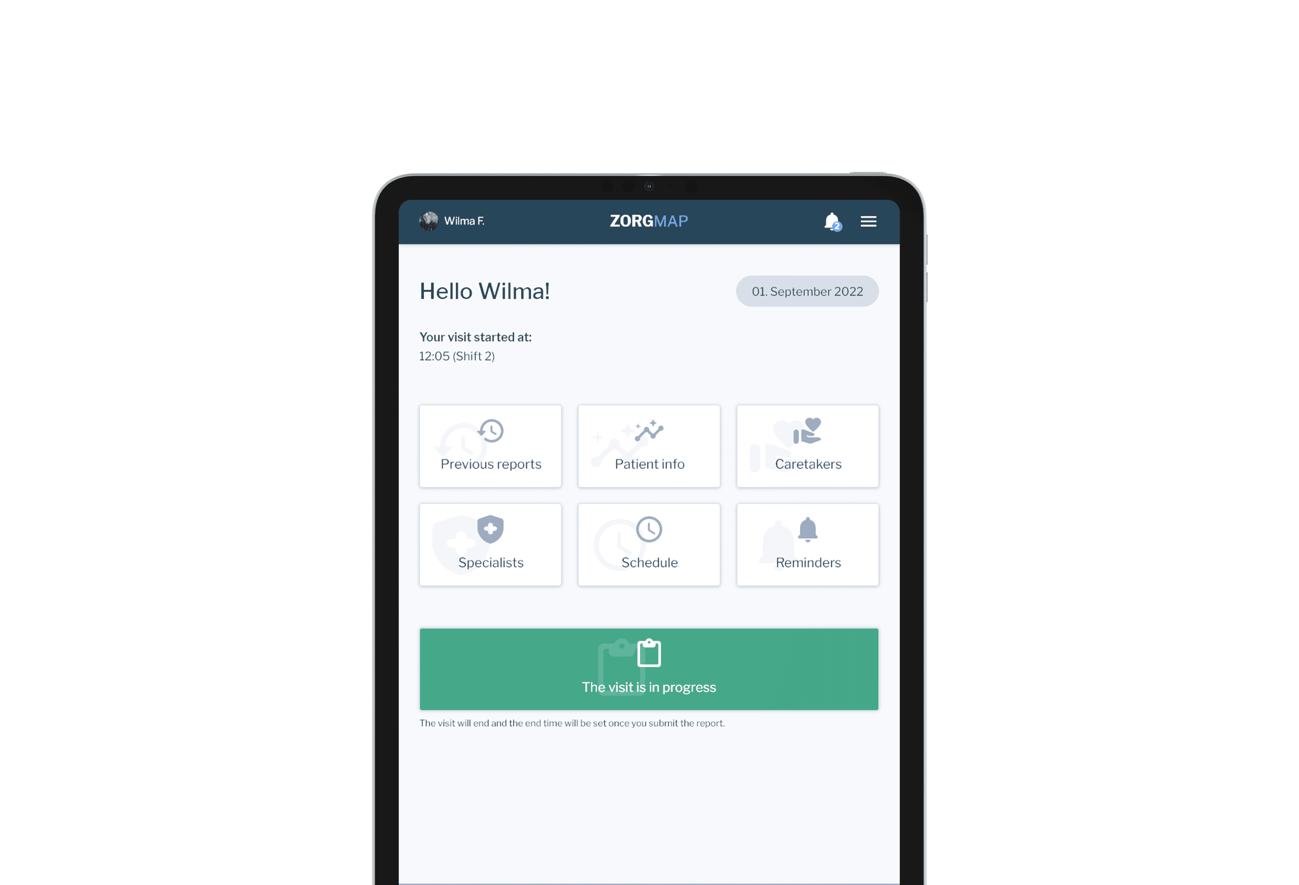
A visit ends when the next shift can read it.
A visit ends when the next shift can read it. That is the rule the whole app is built on, and the home screen enforces it before anything else happens: one button, and the button is the state. Blue, it says Begin visit, with a line underneath saying the slot opened twenty-seven minutes ago. Red, it names what is in the way – the slot is not open yet, there are no visits scheduled, or the previous report is still unsubmitted – and tapping the red button opens that unfinished report, so the obstacle is also the way past it.

The home screen in two of its states – left, the visit open and the button blue; right, the previous report still unsubmitted and the button red.
Inside the visit, I made the form show only what this patient is measured for. The vital parameters are chips switched on per patient – weight, temperature, urine, stool, sugar, blood pressure, oxygen saturation, pain – so nobody scrolls past six fields that do not apply to the person in front of them. Care plans stack as named blocks, a daily one and a bedsores one, each with its own medications and notes.
The visit clock starts itself and stops at log-out, editable if the day went otherwise. Reminders for this visit sit at the top and have to be marked done or rescheduled before the form will submit at all – an open task cannot quietly become somebody else’s problem. And there is one button at the end, not two: Submit form and end the visit. Writing it up is how a visit finishes.

The visit form – reminders at the top, care plans as named blocks, vital parameters switched on per patient, and one button that submits and ends the visit.
Mood is the hardest thing on the form to record, because it is a judgement rather than a measurement. I made it two taps: three faces, then a slider from a little to very much, with the second question rewriting itself around the word chosen – how happy is the patient, not how intense is the mood.

Patient’s mood – three faces for the general mood, then a nought-to-ten slider for how strongly it applies.
That is also why mood is worth two taps: it becomes a number, and numbers accumulate. Patient info plots mood, weight, temperature, urine, stool, sugar, blood pressure, oxygen saturation and pain over a chosen period, daily, weekly or monthly, with the normal range drawn in as a dashed line so a reading outside it is visible without anyone having to remember what normal is. A day’s entry is a dot; a fortnight of them is a trend somebody can act on.

Patient info – the parameters chosen as chips, a date range, and one chart each, with the normal range drawn in as a dashed line.
The report writes itself out of the visit and goes by email. Medications with the times they were given, vital parameters with anything out of range set in red, the daily note, the photographs, and a special attention note the nurse has to switch on deliberately – one thing the next shift cannot miss, marked with a warning triangle. It closes on the reminders due for the next shift, named by shift number. The last thing the report does is hand over.

The emailed report – medications and times, out-of-range values in red, the special attention note, and the reminders waiting for the next shift.